We have introduced the Chart in a pop-up feature, an interactive solution to represent and display data in your publications. Whether for business reports, internal communication documents, surveys, or infographics, charts are perfect to illustrate data in a way that tables or blocks of text cannot reproduce.
Table of contents:
The Charts feature is a premium feature available starting with the Business subscription plan.
To use this feature, you will need to connect a Google sheet document that contains the chart data. We have prepared three Google sheet templates you can use as inspiration when creating your charts. However, if you want to use the templates we offer as examples, you'll need to make a copy of them.
Important: Please remember that for the charts to display the spreadsheet information correctly, you will need to arrange your spreadsheet as shown in the templates we have offered in our Design Studio. That being said, do not leave empty cells on the columns and the chart's lines, but insert 0. Otherwise, you'll be notified that the chart is invalid, or it will display the data wrongly.
How to use Charts
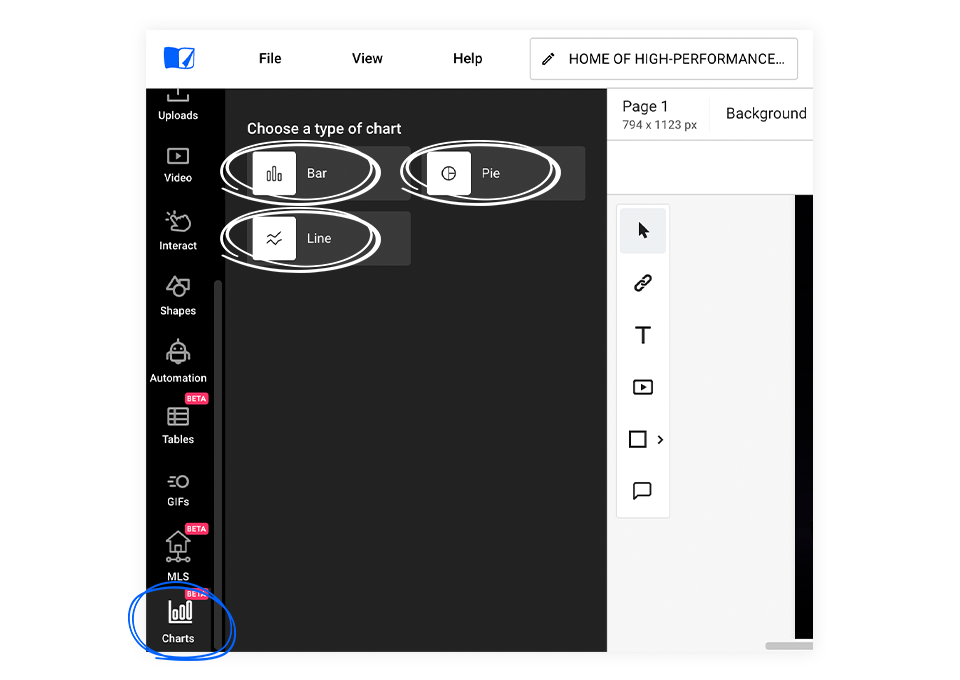
Once you are logged in and in the Design Studio, click on the Charts tab on the left. As you can see, you can choose three different charts: Bar, Pie, and Line. To place the chart in the publication, you can either click on the chart button or drag and drop the element. Regardless of the method, you can adjust the chart’s position afterward.
-
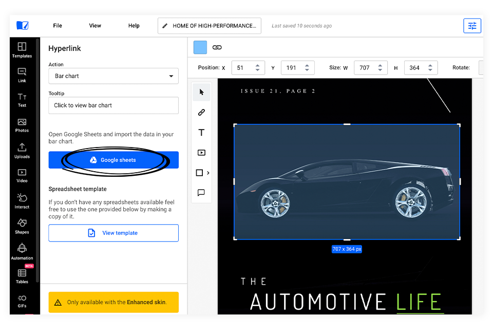
Once you have placed the Charts element in the publication, click on it, and a new menu will appear on the left. Click on the Google sheets button to connect your spreadsheet.
-
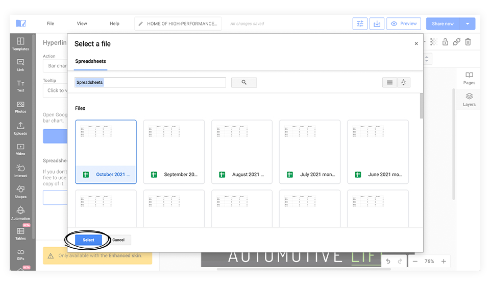
Choose the document and then click on the Select button.
-
Now that the chart overlay is connected with the spreadsheet and on-page click on the Preview button to see how it looks.
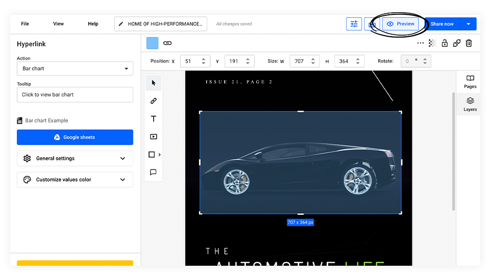
Chart Settings
Each type of chart represents data differently from a visual point of view, and each has its own particular settings you can edit.
There are a few universal settings regardless of the type of chart you choose. All of these can be found when clicking on the Chart element in the menu on the left: Tooltip, General settings, and Customize values color.
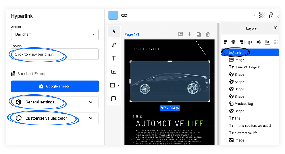
Here’s what each of them does:
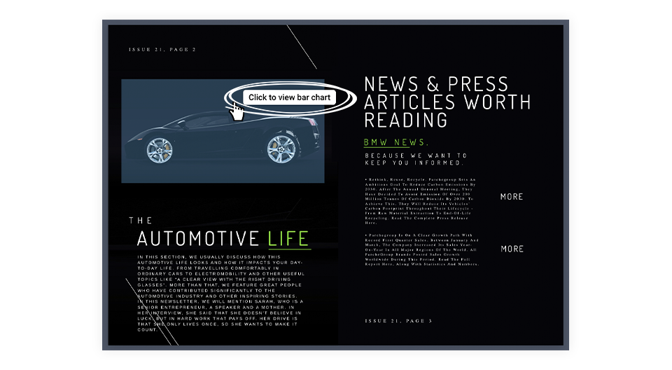
Tooltip - Here, you can change the text that shows up when you hover over the chart element in the publication.
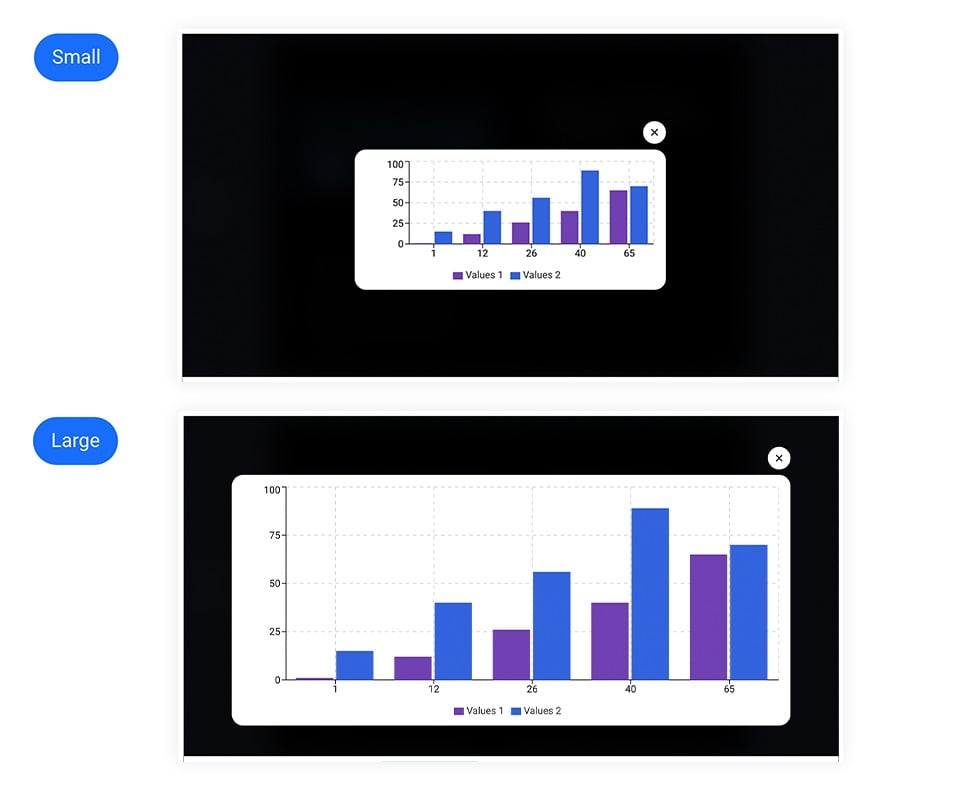
General settings include Chart size and different settings for each type of chart.
-
Chart size - Here, you can change the size of the popup that opens up when you click on the chart element
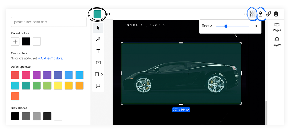
Customize values color - Here, you can change the colors featured in the chart by adding a Hex, RGB, or HSL color code or adjusting the color slide.
By clicking on the Charts overlay on the page, you can also change its color and opacity or lock it in place.
As mentioned, there are three different types of charts, each of which has some particular settings you can modify.
The Bar Chart
Once you have connected the Bar chart overlay with the spreadsheet document, there are different edits you can make.
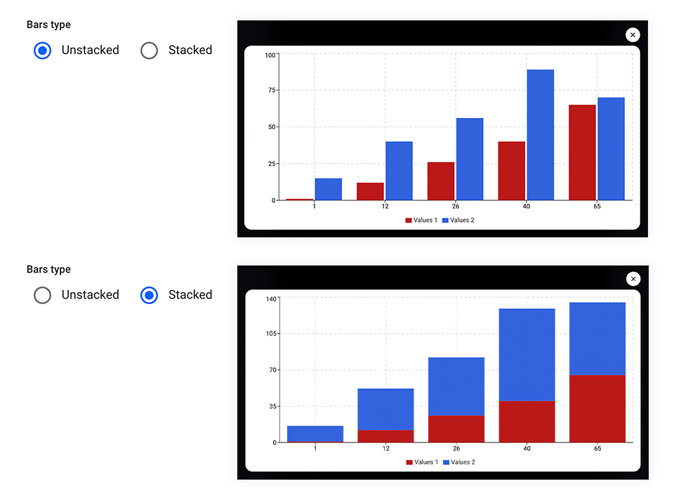
Under General Settings, you can choose between the two Bar types: Unstacked and Stacked.
By hovering the mouse over a column in the chart, you will be able to see the values for that particular column.
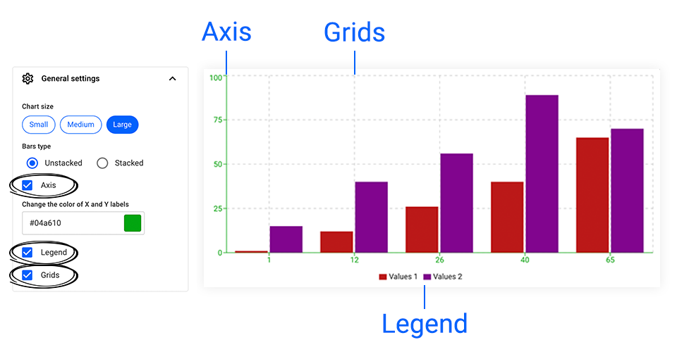
You can also check or uncheck the Axis, Legend, or Grids. If the Axis option is checked, you can change its color.
The Pie Chart
Once you have connected the Pie chart overlay with the spreadsheet document, there are different edits you can make.
Under General Settings, you can choose to include Labels in your Pie. If you tick the Labels’ checkbox, you can set the Labels position: Inside or Outside. You can also change the Labels color if you wish.
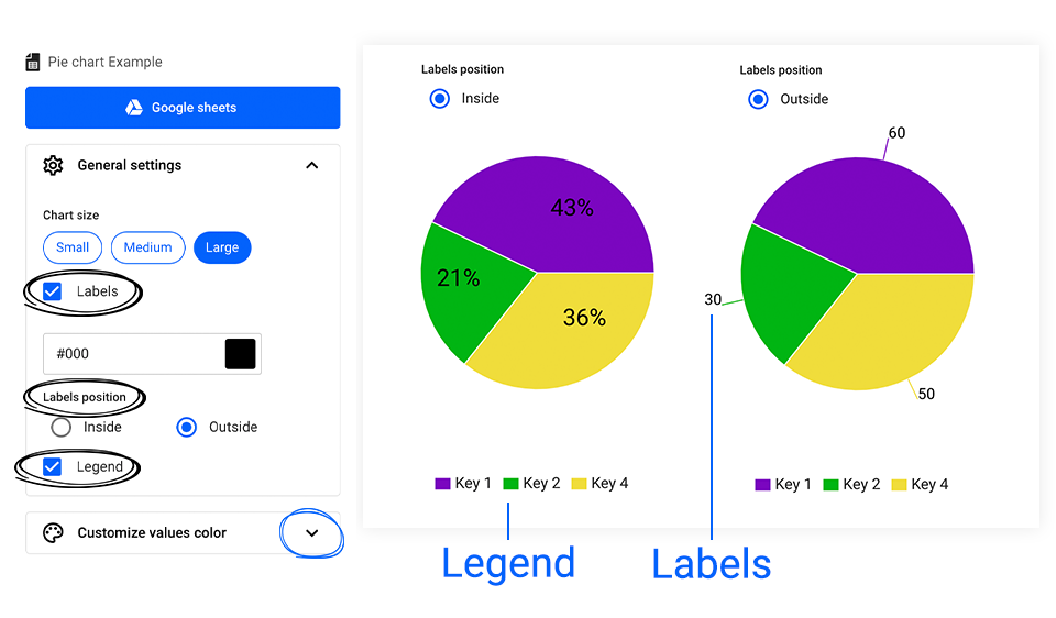
Furthermore, you can also check or uncheck the Legend.
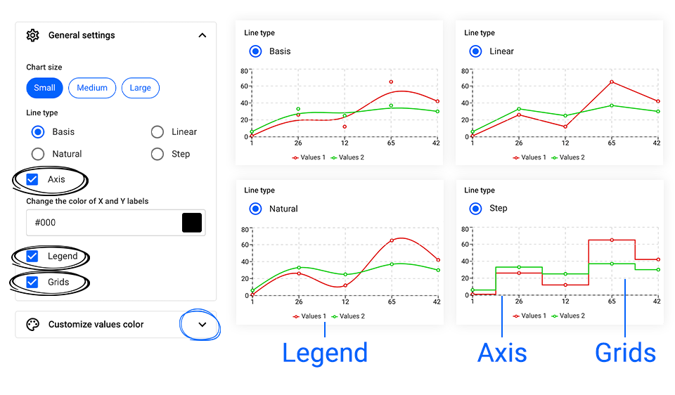
The Line Chart
Once you have connected the Line chart overlay with the spreadsheet document, there are different edits you can make.
Under General Settings, you can choose between four different Line types: Basis, Linear, Natural, and Step.
By hovering the mouse over a section in the chart, you will be able to see the values for that particular section.

You can also check or uncheck the Axis, Legend, or Grids. If the Axis option is checked, you can change its color.
Remember, regardless of the chart type you have chosen, once you are done editing, click on the Preview button to see how it looks.
If you have any questions or further recommendations regarding this feature, please do not hesitate to contact our support team via live chat.