Updated sidebar in Design Studio
Learn the differences between the Design Studio’s old and updated sidebar
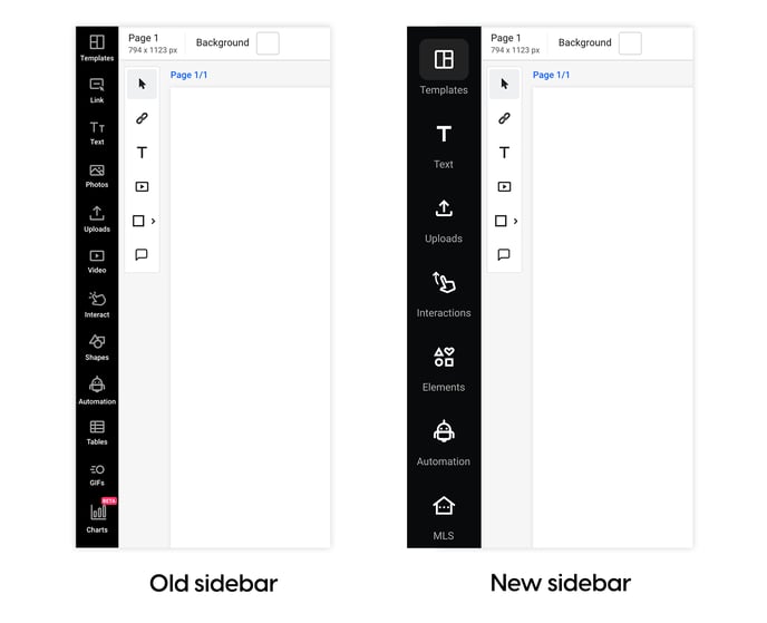
We're thrilled to share that we've rolled out some exciting changes to our Design Studio's sidebar! Our goal is to make your navigation experience as smooth, easy, and intuitive as possible. These updates will transform how you work in Flipsnack, making it more enjoyable and efficient.
What stayed the same
The following buttons and functionalities remain unchanged in the sidebar panel:
- Templates - search and browse through all the templates
- Text - use text templates or add boxes of text for headings, subheadings, body text, and pagination
- Uploads - you will still find your own uploads, your team’s uploads, and the Upload media button
- Automation - connect different types of data sources
- MLS - add and use your database on our platform.

What changed
To improve user experience and make navigation in the Design Studio easier and more enjoyable, we have decided to group a few sidebar elements. Here’s what changed:
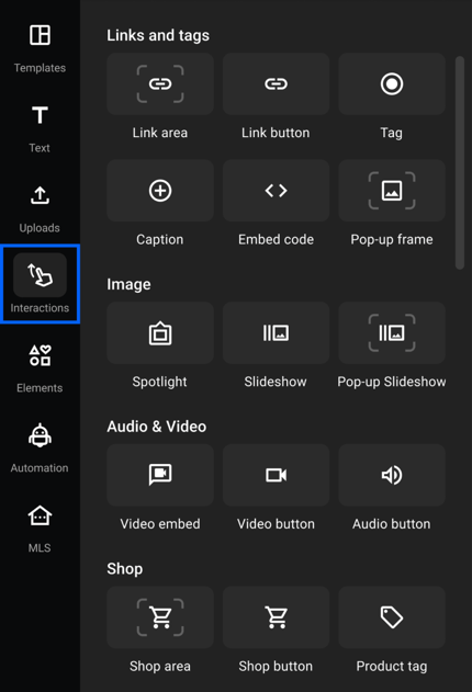
- Interactions - this area will now gather all the interactions you can add to your flipbooks:
- Links and tags - Link area, Link button, Tag, Captions, Embed code, Pop-up frame
- Images - Spotlight, Slideshow, Pop-up slideshow
- Audio & Video - Video embed, Video button, Audio button
- Shop - Shop area, Shop button, Product tag
- Engagement (coming soon) - Quiz, Poll, Question
- Navigation - Previous page, Next page, Go to page, First page, Last page
- Social - All social media buttons
- Others - Cart, Credit card, Buy this item buttons.

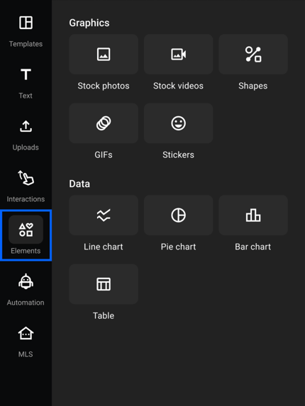
- Elements - here you will find:
- Graphics - Stock photos, Stock videos, Shapes, GIFs, Stickers
- Data - Line chart, Pie chart, Bar chart, Tables

The recent updates to our Design Studio's sidebar are crafted with the user's experience in mind. While preserving the core functionalities that our users have grown to rely on, we've streamlined navigation by thoughtfully grouping related features.
If you have any questions or suggestions, please do not hesitate to contact us via live chat.